Improvement
Improved Payment UI
We have made changes to the payment ui to make it more user-friendly and easier to use
- invoice based orgs can now also connect Polar to their account (At the same time)
- Added option to add text inside the payment plan component columns
- Fixed a bug where the pricing plans border and post a job button in dark mode were always using light mode
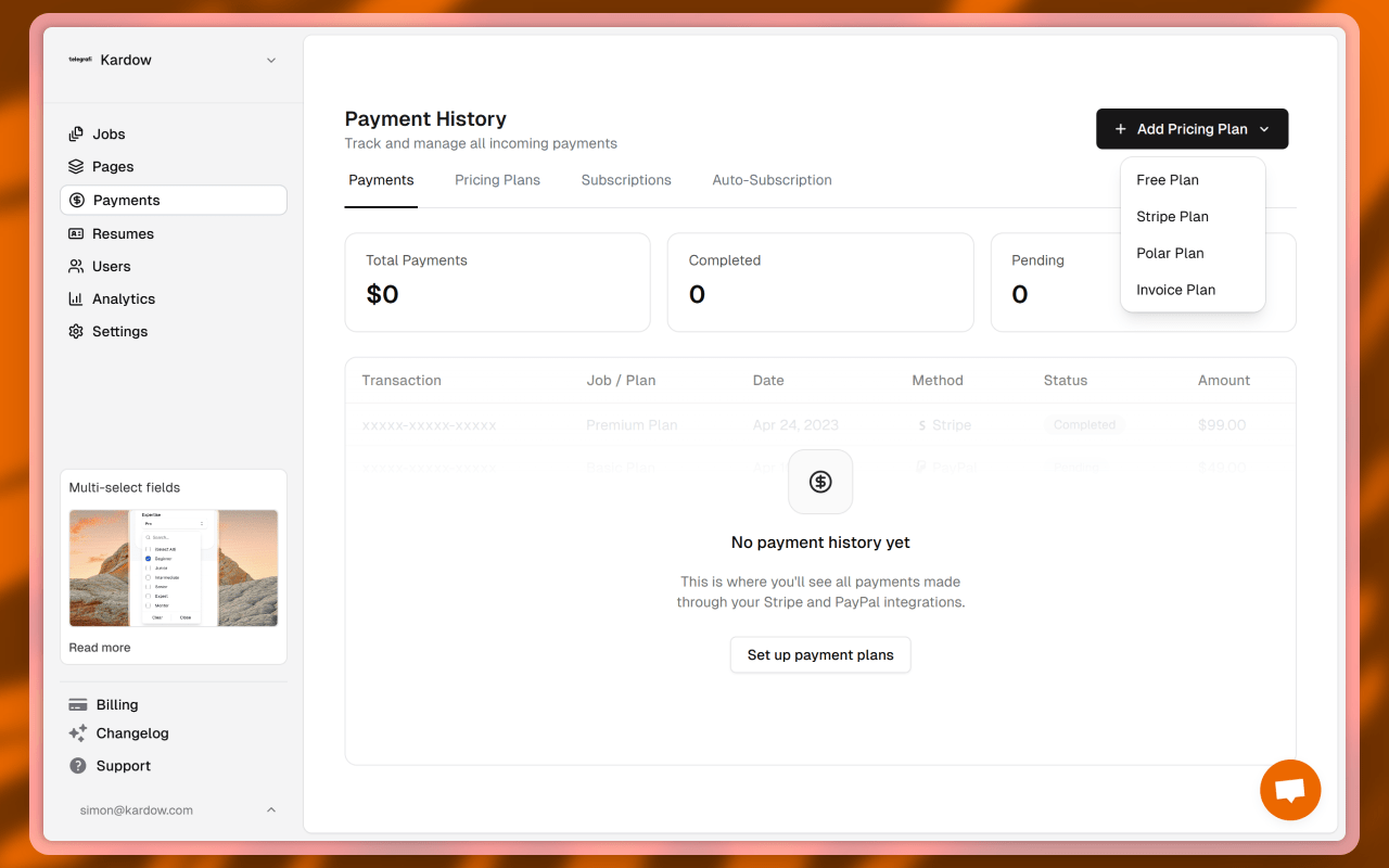
- We are now showing the payment plan title
- We have reduced the size of the currency symbol in the pricing plans because this is a known way to have some impact on the conversion rate
- We have improved the UI of the payments page by adding list tabs and a single select option with all pricing options. This makes it easier to see all options and less cluttered